이 포스팅은 < 파이썬 머신러닝 완벽 가이드(개정 2판) >을 학습하면서 정리한 내용이다.(https://www.yes24.com/Product/Goods/69752484)
자전거 대여 수요 예측
Step 0. 데이터 다운로드 & 라이브러리 & 한글폰트 설치 & 구글 드라이브 연동
1. 실습 데이터 다운로드하기
( https://www.kaggle.com/c/bike-sharing-demand/data?select=train.csv )

2011.01 ~ 2012.12 기간 동안의 날짜/시간, 기온, 습도, 풍속 등의 날씨 정보를 기반으로 한 자전거 대여 횟수가 기재되어 있는 데이터이다.
train.csv 파일을 다운로드 한 후, 후, bike_train.csv로 이름을 변경해 준다.

2. 데이터 정보
Data Fields
| datetime - hourly date + timestamp season - 1 = spring, 2 = summer, 3 = fall, 4 = winter holiday - whether the day is considered a holiday workingday - whether the day is neither a weekend nor holiday weather - 1: Clear, Few clouds, Partly cloudy, Partly cloudy 2: Mist + Cloudy, Mist + Broken clouds, Mist + Few clouds, Mist 3: Light Snow, Light Rain + Thunderstorm + Scattered clouds, Light Rain + Scattered clouds 4: Heavy Rain + Ice Pallets + Thunderstorm + Mist, Snow + Fog temp - temperature in Celsius atemp - "feels like" temperature in Celsius humidity - relative humidity windspeed - wind speed casual - number of non-registered user rentals initiated registered - number of registered user rentals initiated count - number of total rentals |
3. 라이브러리 & 한글 폰트 설치
이 실습은 Google Colab에서 진행할 것이다. 다음의 코드를 실행해 준다.
!pip install lightgbm==3.3.2  # lightBGM 다운그레이드 설치
!sudo apt-get install -y fonts-nanum
!sudo fc-cache -fv
!rm ~/.cache/matplotlib -rf
import lightgbm
lightgbm.__version__ # 버전확인
- 런타임 다시 시작 후, 아래 테스트 코드 실행
import matplotlib.pyplot as plt
plt.rc("font", family="NanumGothic") # 라이브러리 불러오기와 함께 한번만 실행

plt.plot([1, 2, 3])
plt.title("한글")
plt.show()
- 구글 드라이브 연동하기
from google.colab import drive
drive.mount('/content/drive')
Step 1. 라이브러리 & 데이터 준비
- 라이브러리 불러오기
import numpy as np
import pandas as pd
import seaborn as sns
import matplotlib.pyplot as plt
%matplotlib inline

import warnings
warnings.filterwarnings('ignore',category = RuntimeWarning)
- 데이터 불러오기
bike_df = pd.read_csv("bike_train.csv")
print(bike_df.shape)
bike_df.head(3)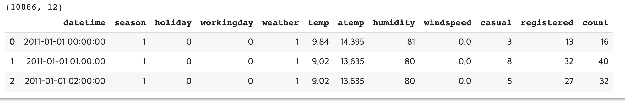
- 데이터 정보 확인
bike_df.info()
- 날짜 데이터 datetime으로 변경 후, 년/월/일 추출
# 문자열을 datetime 타입으로 변경.
bike_df['datetime'] = bike_df.datetime.apply(pd.to_datetime)

# datetime 타입에서 년, 월, 일, 시간 추출
bike_df['year'] = bike_df.datetime.apply(lambda x : x.year)
bike_df['month'] = bike_df.datetime.apply(lambda x : x.month)
bike_df['day'] = bike_df.datetime.apply(lambda x : x.day)
bike_df['hour'] = bike_df.datetime.apply(lambda x: x.hour)
bike_df.head(3)
Step 2. 데이터 가공 & 탐색적 데이터 분석
- 칼럼 삭제
# 컬럼 삭제
drop_columns = ['datetime','casual','registered']
bike_df.drop(drop_columns, axis = 1, inplace = True)
년/ 월 / 일로 분류한 datetime 컬럼과 casual + registered = count 이므로, casual, registered 컬럼을 삭제해 준다.
- 시각화
cat_features = ['year', 'month','season','weather','day', 'hour', 'holiday','workingday']
fig, ax = plt.subplots(figsize = (16,8),ncols = 4, nrows = 2)
for i , feature in enumerate(cat_features):
  row = int(i/4) # 몫 0,1
  col = i % 4 # 나머지
  sns.barplot(x = feature, y = 'count',data = bike_df, ax = ax[row][col])
  ax[row][col].set_title(f"ax[{row}][{col}]")

plt.show()
Target 값(종속 변수)인 count(대여 횟수) 컬럼을 기준으로 데이터 분포를 살펴본다.

ax [0][0] : 2012 > 2011 상대적으로 count 값이 2012 년에 더 높음
ax [0][1] : 월별 분포. 6,7,8,9 월이 count 값 높음
ax [0][2] : 계절별 분포. 여름, 가을이 count 값 높음
ax [0][3] : 날씨 분포, 맑거나(1) 약간 안개(2)가 있는 경우 count 값 높음
ax [1][1] : 시간별 분포, 오전 출근시간(8), 오후 퇴근시간(17,18) 이 상대적으로 높음
다음 포스팅으로 이어진다.
'Data Science & AI > Machine Learning' 카테고리의 다른 글
| [Machine Learning] 하이퍼 래퍼 XGBoost API - 위스콘신 유방암 예측 (0) | 2023.08.29 |
|---|---|
| [Machine Learning] 회귀 , Kaggle 자전거 대여 수요 예측 - 2 (0) | 2023.08.24 |
| [Machine Learning] 앙상블 학습, Voting Classifier - 유방암 데이터 세트 (0) | 2023.08.22 |
| [Machine Learning] 머신러닝 알고리즘 구현 - 붓꽃 품종 예측하기 (0) | 2023.08.22 |
| [Python] 데이터 인코딩 - 레이블 인코딩, 원핫 인코딩 (0) | 2023.08.17 |


