728x90

이 포스팅은 matplotlib.GridSpec과 seaborn 라이브러리를 사용해서 여러개의 시각화 그래프를 그리는 방법에 관한 내용을 담고 있다.
(예시 데이터는, seaborn 라이브러리의 titanic 데이터를 사용한다.)
시각화 그래프 구조
1. matplotlib.pyplot , seaborn - 그래프 시각화
2. matplotlib.gridspec 사용 - 서브플롯의 위치 & 크기 정교하게 조정
3. for ~ in enumerate 반복문 사용
0. 데이터 & 라이브러리 불러오기
import pandas as pd
import numpy as np
import matplotlib.pyplot as plt
import seaborn as sns
import matplotlib.gridspec as gridspec # 서브플롯 크기 & 위치 조정

df = sns.load_dataset('titanic')
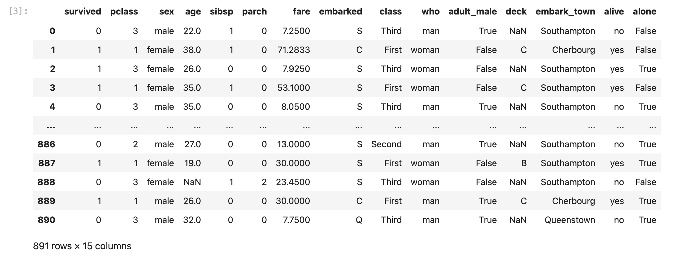
1. countplot 그리기
예시 ) 타이타닉 데이터로 countplot 그리기
1. 그리드 설정 및 전체 크기 설정
import matplotlib.gridspec as gridspec

grid = gridspec.GridSpec(2,2) # 2 x 2, 4가지 그래프

# 도화지 그리기
plt.figure(figsize = (16,10)) # 전체 그림 크기
plt.subplots_adjust(wspace = 0.5, hspace = 0.4) # 서브플롯 간 간격 조절
2. 피쳐 선택
mpg_features = ['manufacturer', 'model', 'category', 'drv']
countplot 이기 때문에, 범주형 변수를 선택했다.
3. 서브플롯 생성
for idx, feature in enumerate(cat_features):
    ax = plt.subplot(grid[idx])
    sns.countplot(x=feature, data=df, palette='pastel', ax=ax)
    ax.set_title(f'{feature} Distribution')
4. 전체 그래프 표시
plt.show()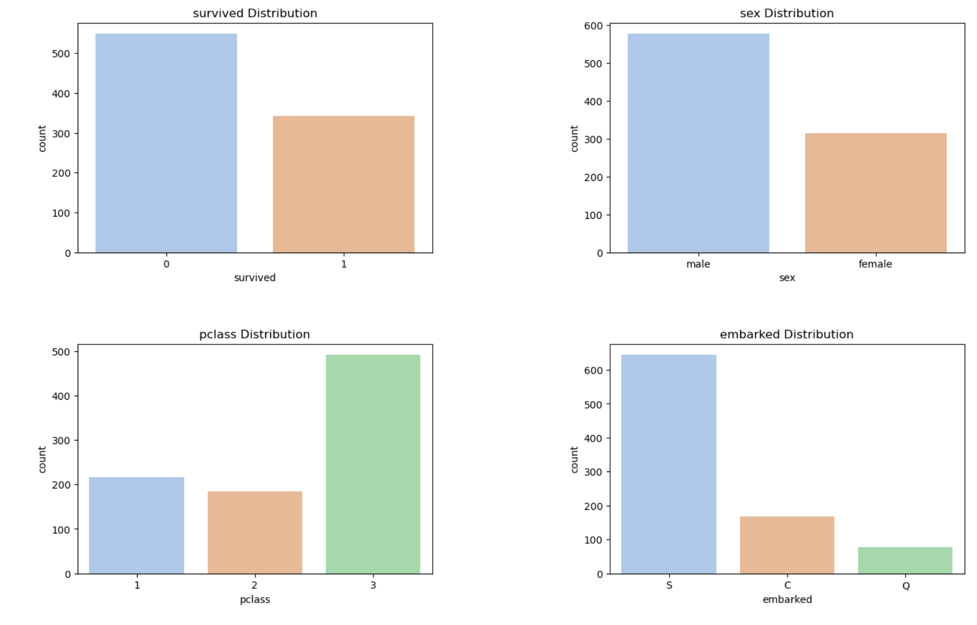
+ parameter 추가 (hue)
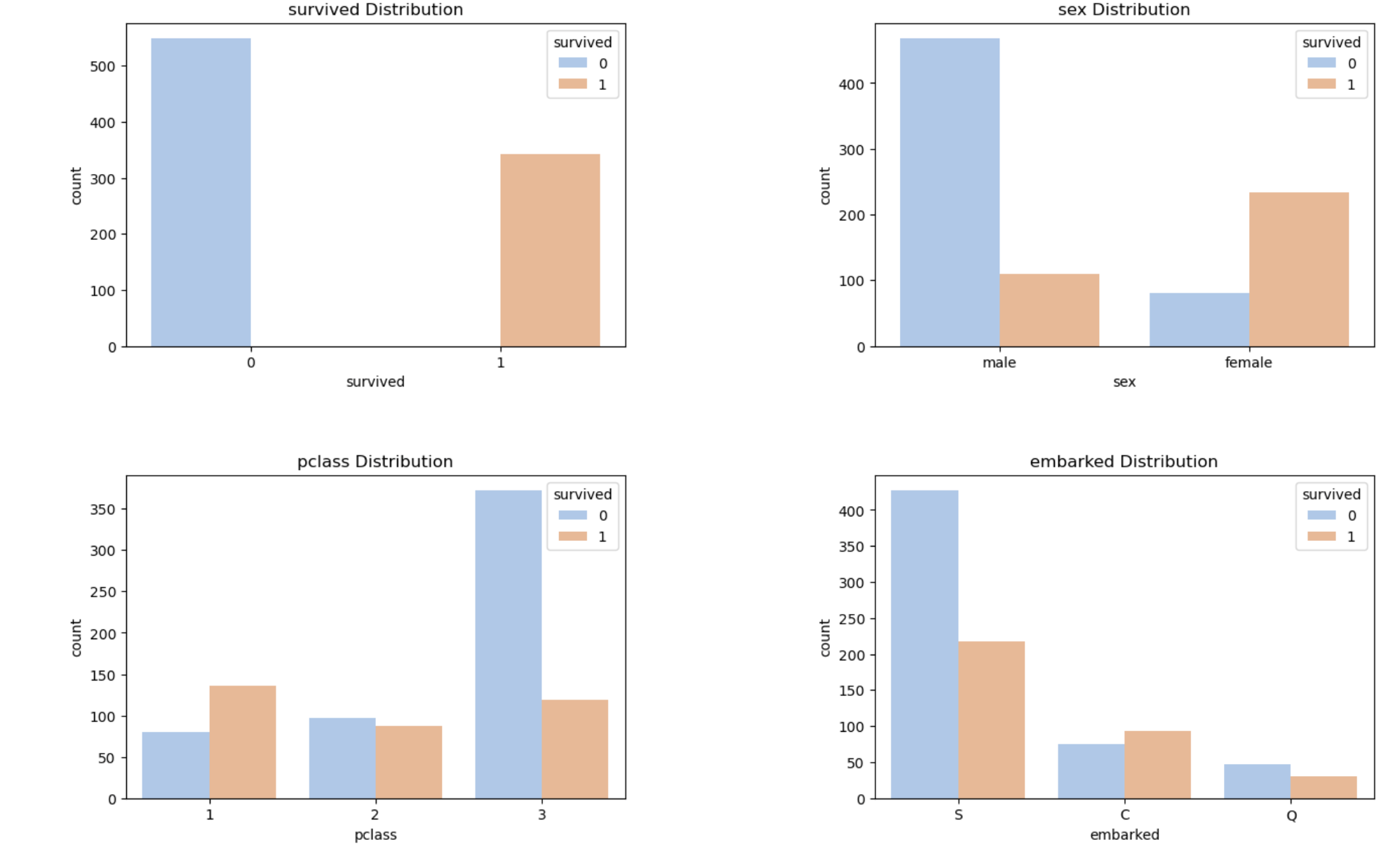
위 코드에 hue = 'survived' 범례 파라미터를 추가하면 다음과 같은 그래프가 출력된다.
타이타닉 생존자(survived = 1)와 사망자(0) 간 색상 차이로 그래프 분포를 개별적으로 확인할 수 있다.
4. Plot 함수화
plot, 데이터프레임, 피쳐를 입력받아서 seaborn 라이브러리 내에 Plot을 구현하는 함수를 작성했다.
countplot을 기본값으로 두고, plot별로 나눠서 시각화한다.(임의로 y = 'survived'로 지정, 목적에 따라 변경)
import matplotlib.gridspec as gridspec
import matplotlib.pyplot as plt
import seaborn as sns
import math

def create_plots(dataframe, cat_features, plot_type='countplot'):
    # 피처 개수에 따라 그리드의 행과 열을 계산
    num_features = len(cat_features)
    num_rows = math.ceil(num_features / 2)
    num_cols = 2

    # 그리드 설정
    grid = gridspec.GridSpec(num_rows, num_cols)

    # 전체 도화지 크기 설정
    plt.figure(figsize=(16, 5 * num_rows))

    # 서브플롯 간의 간격 조절
    plt.subplots_adjust(wspace=0.5, hspace=0.4)

    # 각 범주형 변수에 대해 plot 그리기
    for idx, feature in enumerate(cat_features):
        # 그리드의 현재 위치에 서브플롯 생성
        ax = plt.subplot(grid[idx])

        # plot_type에 따라 다른 plot 그리기
        if plot_type == 'countplot':
            sns.countplot(x=feature, data=dataframe, palette='pastel', ax=ax)
        elif plot_type == 'barplot':
            sns.barplot(x=feature, y='survived', data=dataframe, palette='pastel', ax=ax)
        elif plot_type == 'violinplot':
            sns.violinplot(x=feature, y='survived', data=dataframe, palette='pastel', ax=ax)
        elif plot_type == 'boxplot':
            sns.boxplot(x=feature, y='survived', data=dataframe, palette='pastel', ax=ax)

        # 서브플롯 제목 설정
        ax.set_title(f'{feature} Distribution')

    # 전체 그래프 표시
    plt.show()
728x90
'Data Science & AI > Data Analysis' 카테고리의 다른 글
| 시계열 분석 - 시계열 데이터 특성, ARIMA (1) | 2024.01.08 |
|---|---|
| Correlation Analytics - 상관계수, 공분산 계산 (0) | 2023.12.01 |
| [Python] 시계열 데이터 결측치 처리 (0) | 2023.10.08 |
| [텍스트 분석] 정규표현식(전화번호 패턴, 이메일 패턴) (0) | 2023.08.31 |
| [Python] 데이터 분석_ Index Alignment (1) | 2023.08.10 |


